This was a collaboration by Me ( Mr Leon Taylor) and Matt Haworth for the Event Overload NZ
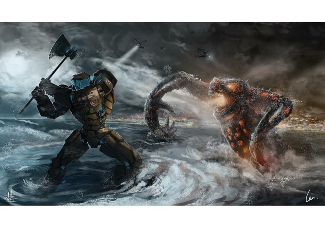
I put together a rough compostion of the area with the background and Kaiju, that I later sent to Matt and who later roughed in the Jager in before we decided on the composition. I wanted to make mine aggressive as possible and charging at the Jager after he had made his way through the city.
KAIJU vs JAGER - Pacific Rim Fan-Art 2015
Below is the finished piece, to follow is the rough and process I have taken through the collaboration.
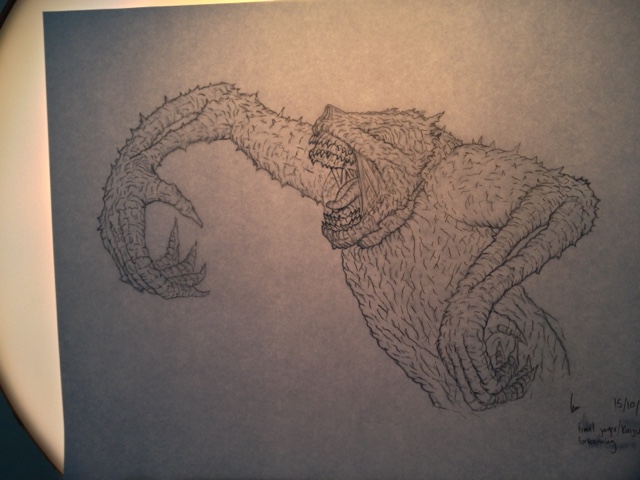
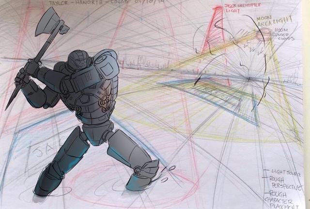
The rough Design and composition I drew up, that Matt Haworth later inserted his WW2 style Jager.
The First pieces of Line-work for the huge Kaju vs the Photoshopped Coloured Version with light bounce and elements be fore adding to the background.
MR LEON TAYLOR
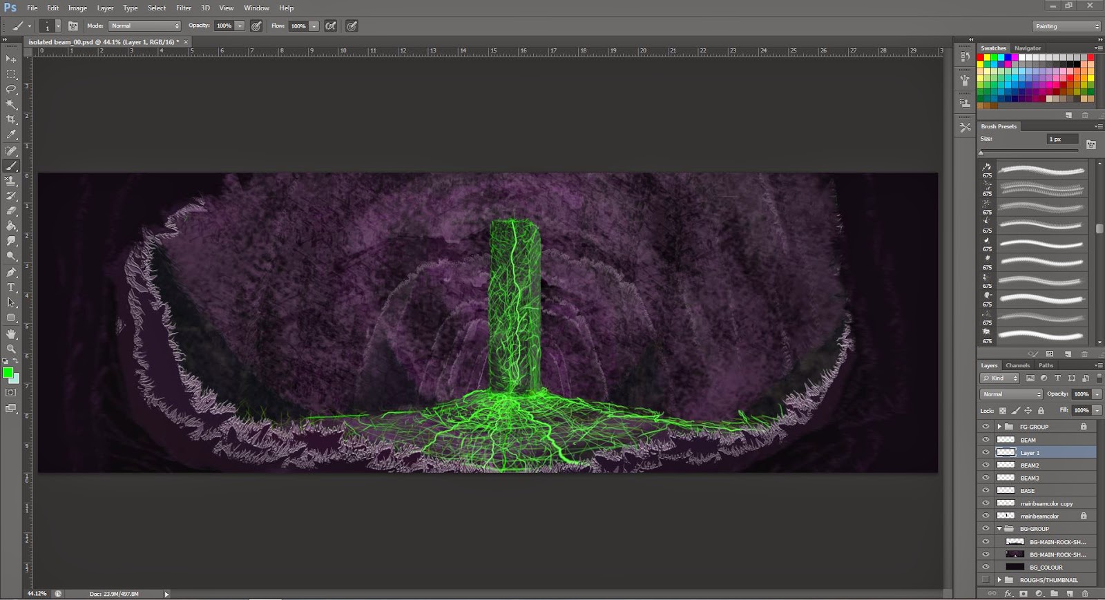
- BACKGROUND PROCESS-
1)Get the prespective ready and general landscape.
2) Add inn intial light and lights in city.
3) Map out the distruction from where the Kaju has come from and add moon and background lightining.
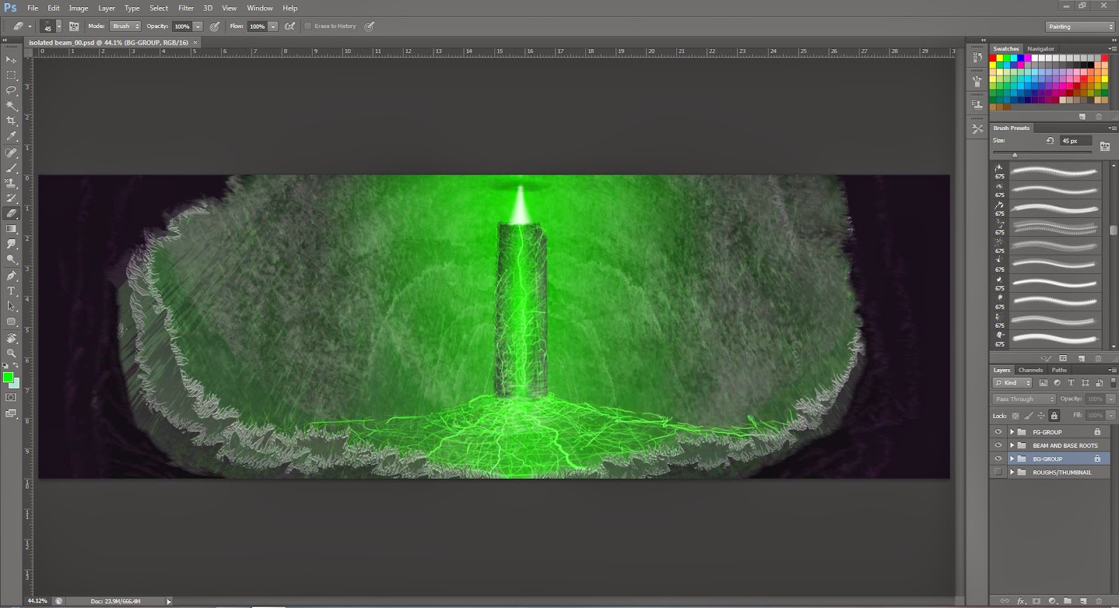
4) Work on clouds and light source and smoke over the city.
5) Add the cold vs warm tones to match Characters and add contrast to the battle.
6) Clean up city area make it feel like it has more depth and a shore line give the clouds more volume.
7) Burn that city down, make it feel like terror has been and that it is about to colapse and add movement in the ocean where the Jager and Kaju will be.
8) Add the rays of light that will be hitiing our characters.
9) Insert Kaju and then look work with Matt on a final composition.
This was a great challenge and I got so much from it. I live to collaborate and especially with people who have a similar background and love to finishing projects.